Why Design Studios
Full-service design & branding agency
Branding // Websites // Marketing campaigns
Why Design Studios
Full-service design & branding agency
Branding
Websites
Marketing
We create brands that speak to the right people using engaging design & marketing know-how.
Why Design Studios is a collaborative branding agency in Lincolnshire, who comprise a talented team of designers, marketeers, photographers and copywriters. We operate across the UK servicing SME’s and public sector organisations aiming to deliver work which is commercially and practically realistic, without compromising on creativity.
Featured projects


Helping your business thrive
Latest stories
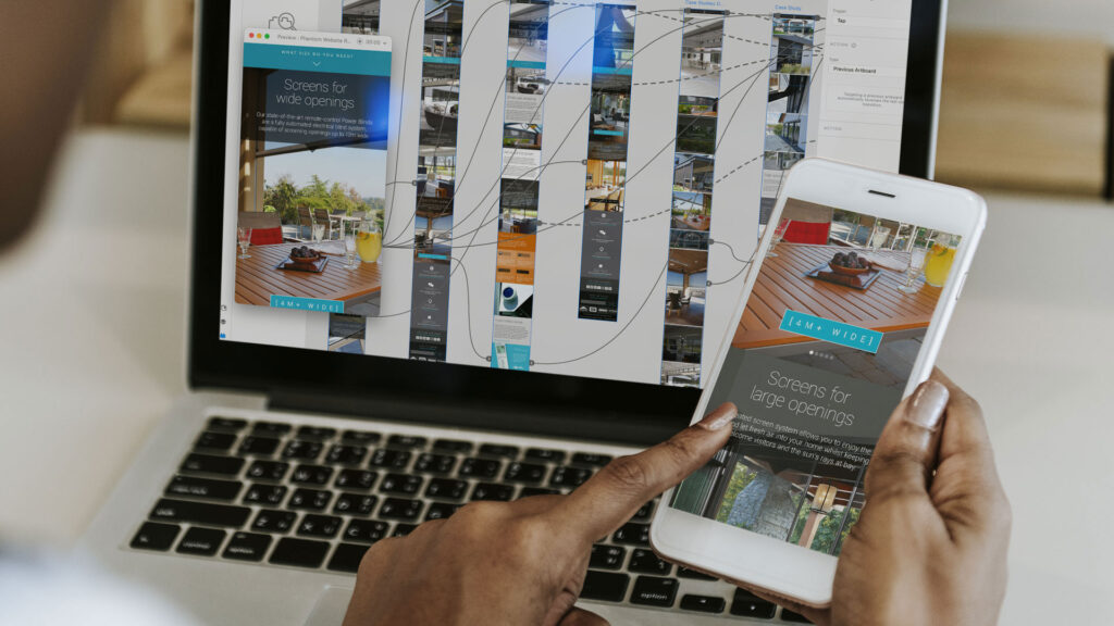
Repositioning a national brand in the UK
Phantom wanted to reposition their retractable screens as a premium product within the home automation sector, appealing to both self-builders and architects.
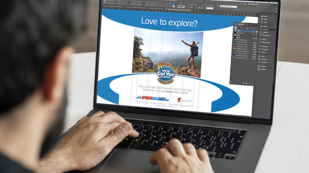
Becoming the UK’s No.1 online destination
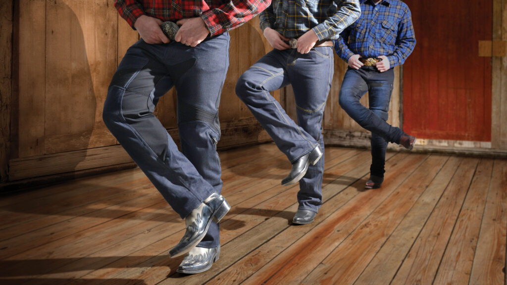
My work helped contribute to the growth of a business that is now recognised as the “UK’s No.1 online destination for motorcycle clothing and accessories.
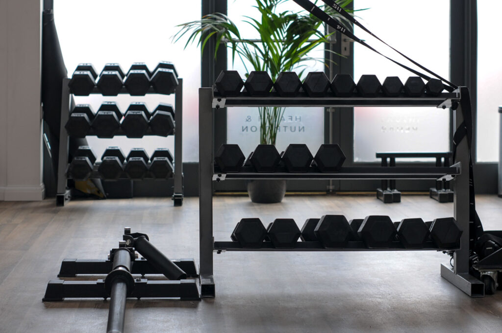
Bringing branding into the built environment
This new health studio required a full branding package for use across the building, staff uniform, website, social media and all associated marketing collateral.